Redlining & Poverty Map
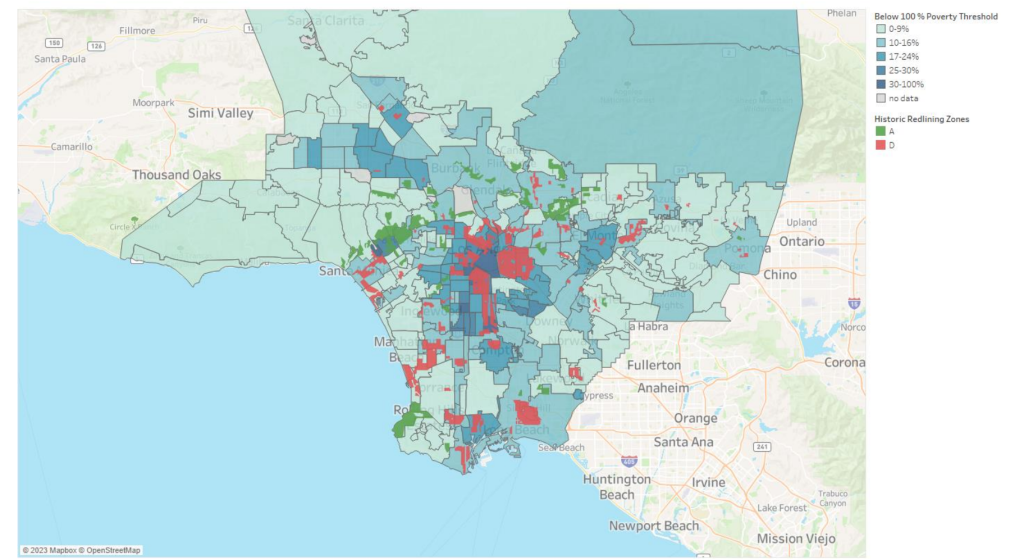
As a part of the City of Los Angeles Poverty Summit report, NDSC mapped historic redlining boundaries on top of current day poverty rates by neighborhood to show the profound and lasting consequences of racially discriminatory policies.

Map displays the distribution of poverty across Los Angeles neighborhoods, with neighborhoods in deeper blue indicating higher poverty, overlaid with historic “redlining” zones. The HOLC created a grading system to reflect a neighborhood’s “mortgage security”. Neighborhoods receiving an “A” (colored green on the map above) were deemed minimal risks for banks and lenders. Those receiving a “D” (colored red on the map above) were neighborhoods that were considered hazardous and therefore “redlined.”

